Introduction to the layout
Each page of the dashboard has the following structure, look and fill. The image below is zoomed out, and thus components of the page appear to be distorted. The actual dashboard zooms in on these components, allowing the user to scroll up, down left and right, view all the components separately and clearly, thus providing a much more comfortable user experience.
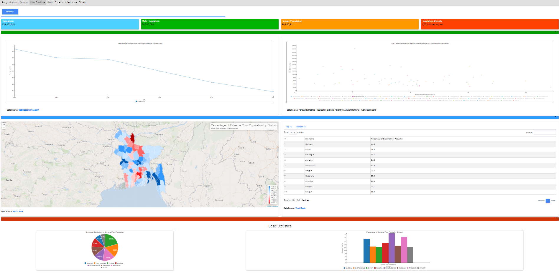
Fig 1. Layout of the Web Pages (Zoomed out in order to provide an overview of the complete page)
The components found in each web page are as follows:
Distributions of the Indicator
The top bar

Fig 2. The Top Bar of the Web Page
The top bar of the dashboard helps the user to specify the category of the socio-economic aspect that he/she wants to gain information about from the dashboard. While “Living Conditions” is the category selected when the user first enters the page, the user can click on the other buttons to change the page and navigate to their preferred category.
The Indicator Selector
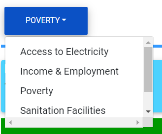
Fig 3: The Indicator Selector
Once the category is selected, the indicator selector allows the user to explore and navigate to find data about the socio-economic condition that they want to explore. The selector appears as a dropdown menu, and allows the user to select from a variety of options, in order to explore, and answer queries from the website.
Key Facts Bar:

Fig 4: Key Facts
In order to provide contextual information related to the socio-economic aspect and provide the user an intuitive overview about the situation on the ground, the key facts bar provides four germane statistical facts.
Time Series
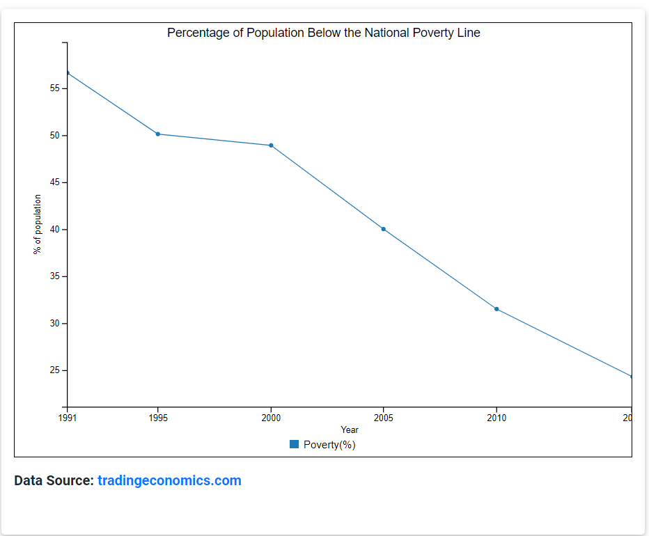
Fig 5: Time Series Information on the Indicator
To monitor the change of the state of an indicator in Bangladesh, we use a timeseries, which displays the change in the value of the indicator over the years. The data source that fuels the time series is specified below the figure. The timeseries visualization helps users to understand the trends in how the indicator has been changing over the years.
Scatter Plot
Fig 6: Scatterplot Visualizations
Scatterplots show bivariate distributions which allow users to explore how an indicator correlates a different attribute, and can imply apparently hidden information to the users. For example, the scatterplot in the figure above, shows the joint distribution of per capita income in Bangladesh and the percentage of population living below the national extreme poverty line. A district whose corresponding point in the graph shows high per capita income as well as a high percentage of extreme poor people may imply that the district has high income inequality.
For more information on how to interpret a scatter plot, visit the following link: https://www.dummies.com/education/math/statistics/how-to-interpret-a-scatterplot/#:~:text=You%20interpret%20a%20scatterplot%20by,to%20increase%20(move%20up).
In our interactive dashboard, once the user hovers his mouse pointer over a point in the scatterplot, the website shows the coordinates of the point and the district it represents. It is noted here that many of the inferences gathered by studying the joint distributions denoted by the scatterplots in our dashboard should be taken with a pinch of salt, since they combine data from different years.
Choropleth Visualizations
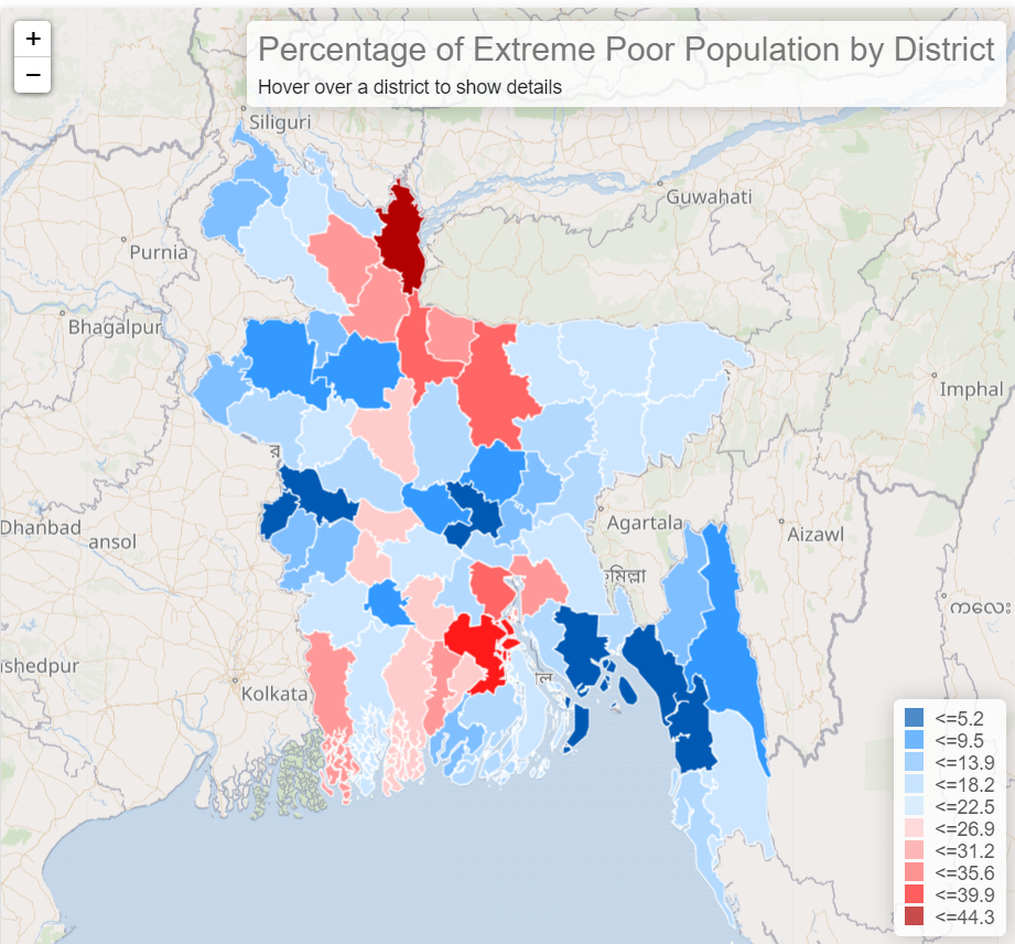
Fig 7. Choropleth Maps
Choropleth maps help the user to monitor the condition of the indicator at a subnational level of granularity. All choropleth maps in our website contain district-level information about the indicator. The districts are coloured on a scale of deep red to deep blue, signifying levels of districts in bad conditions to districts in good condition with respect to the socio-economic condition being indicated. The districts are divided into 10 classes, based on the values of the indicators in those districts. The most favourable value of the indicator among all the districts is subtracted with that of the least favourable value, and the interval is divided into 10 equal ranges to derive these classes.
Our interactive dashboard lets the user know about the value of the indicator in each district when they hover the mouse pointer over it, and lets the user zoom into and out of the map. Thus choropleth maps help the user to quickly understand which districts lag behind in which socio-economic aspect, according to the available data.
Tabulated Information
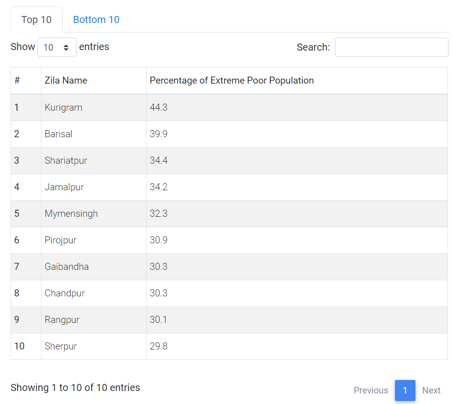
Fig 8. Tables in our dashboard
Complementing the information found in the choropleths, the accompanying tables rank the district in terms of the values of the indicator in them and helps the user to find the districts with the greatest and least needs of intervention with respect to the socio-economic condition indicated. The search bar allows users to search for a district, and find the value of the indicator in that district. The user can toggle among the top 10 and bottom 10 tabs to find districts with the most and least deprived districts respectively. Thus, the tabular information can help the user identify districts that are “deprived” in a certain aspect of socio-economic development.
Distributions of the Indicator
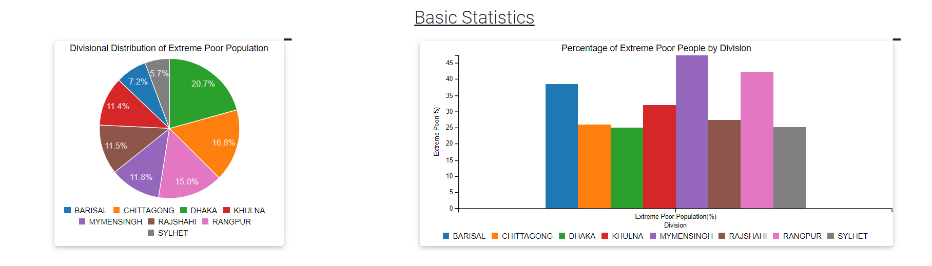
Fig 9. Sample Pie and Bar Charts in our Dashboard
Accompanying the information and visualizations mentioned above, the website also provides information about the distributional characteristics of each indicator through pie charts and bar charts. Typically, this section demonstrates how resources are distributed across divisions of Bangladesh and how the value of each indicator in each division. This allows users to gain a regional overview of the distribution of the indicators. In case of primary education, these charts are used to show the gender distribution of teachers and students in primary schools.